Theme the widget
The Ping (ForgeRock) Login Widget provides a default theme with both light and dark modes.
You can alter these themes by using the Tailwind configuration file.
Switch between light and dark themes
To switch to the dark mode, you can manually add tw_dark to the <body> element:
<body class="tw_dark"></body>The Ping (ForgeRock) Login Widget defaults to the light mode if the class is not present.
You can programmatically apply the class if required:
const prefersDarkTheme = window.matchMedia('(prefers-color-scheme: dark)').matches;
if (prefersDarkTheme) {
    document.body.classList.add('tw_dark');
}
Customize the theme
To reconfigure the theme to use different colors, fonts, or sizing you can provide new values to the Tailwind configuration file and rebuild the Ping (ForgeRock) Login Widget, as follows:
-
Download the Ping (ForgeRock) Web Login Framework from the GitHub repository:
git clone https://github.com/ForgeRock/forgerock-web-login-framework.git -
In a terminal window, navigate to the root of the Ping (ForgeRock) Web Login Framework:
cd forgerock-web-login-framework -
Run
npmto download and install the required packages and modules:npm install -
Run the development script:
npm run dev -
Run Storybook:
npm run storybookMake a note of the URLs to the Storybook UI listed in the terminal output:
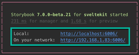 Figure 2. URLs to the Storybook UI
 -
Open the
tailwind.config.cjsfile in the root of the Ping (ForgeRock) Web Login Framework and adjust your theme by adding them under theextendproperty:// tailwind.config.cjs module.exports = { content: ['./src/**/*.{html,js,svelte,ts}', './.storybook/preview-head.html'], darkMode: 'class', presets: [require('./themes/default/config.cjs')], theme: { extend: { // Add your customizations here colors: { body: { light: 'darkblue', }, primary: { dark: 'darkorange', }, background: { light: "gainsboro", }, }, fontFamily: { sans: ['Impact'], }, }, }, }; -
Navigate to the Storybook UI provided in the terminal output earlier to view your changes:
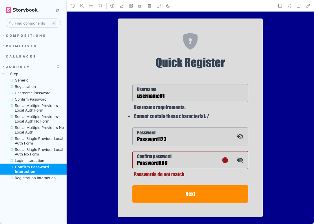 Figure 3. Customized registration modal in Storybook
Changes you make to the
tailwind.config.cjsfile are automatically reflected in the Storybook UI when you save them to disk.