Advanced Identity Cloud analytics dashboard
PingOne Advanced Identity Cloud analytics dashboard provides a comprehensive snapshot of your Advanced Identity Cloud system usage. You can use the dashboard to gain valuable insights on your tenants:
Monitor the number of users and engagements
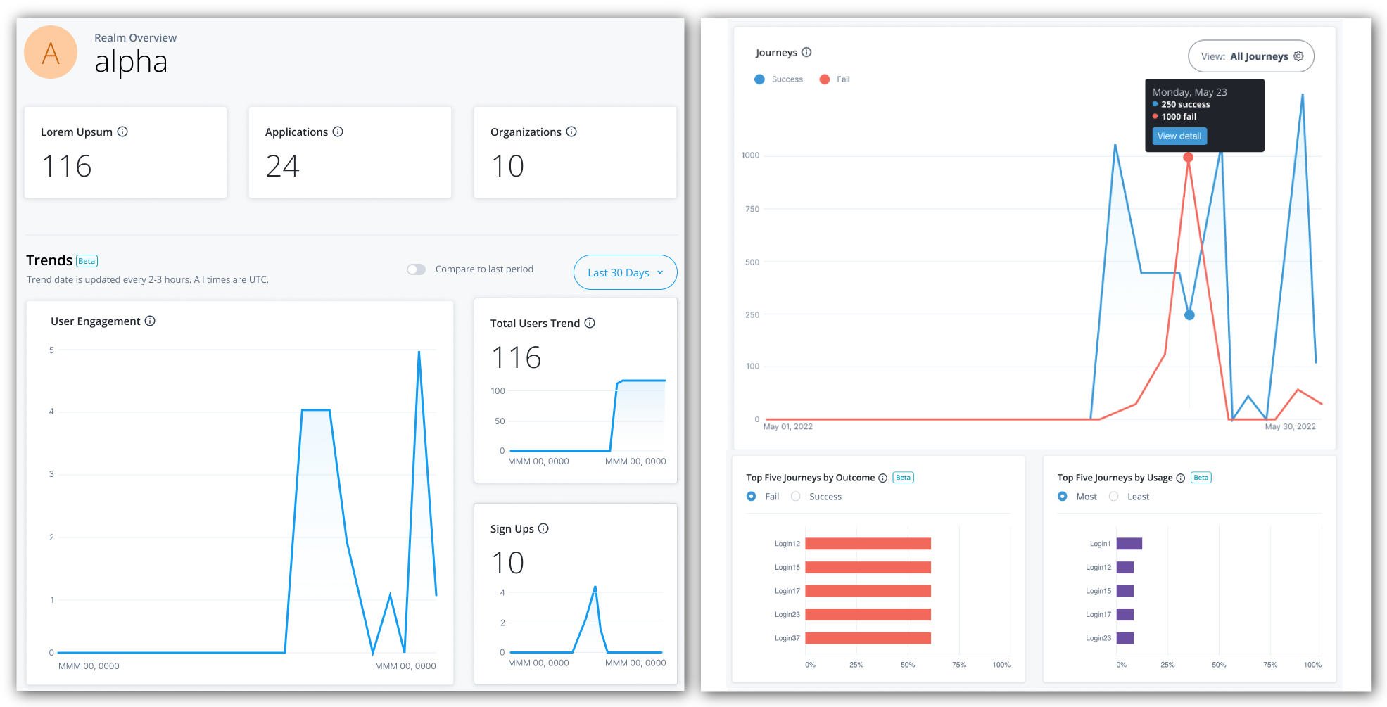
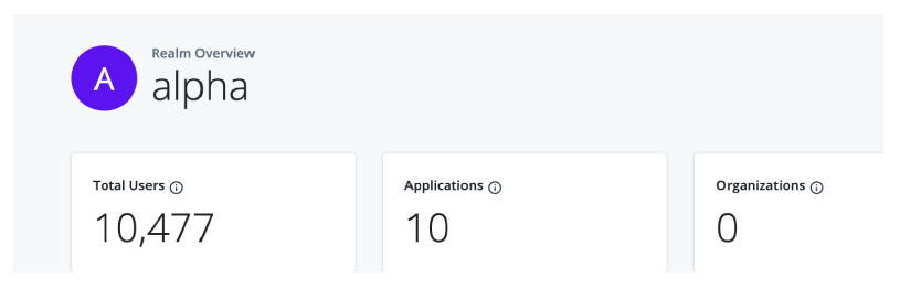
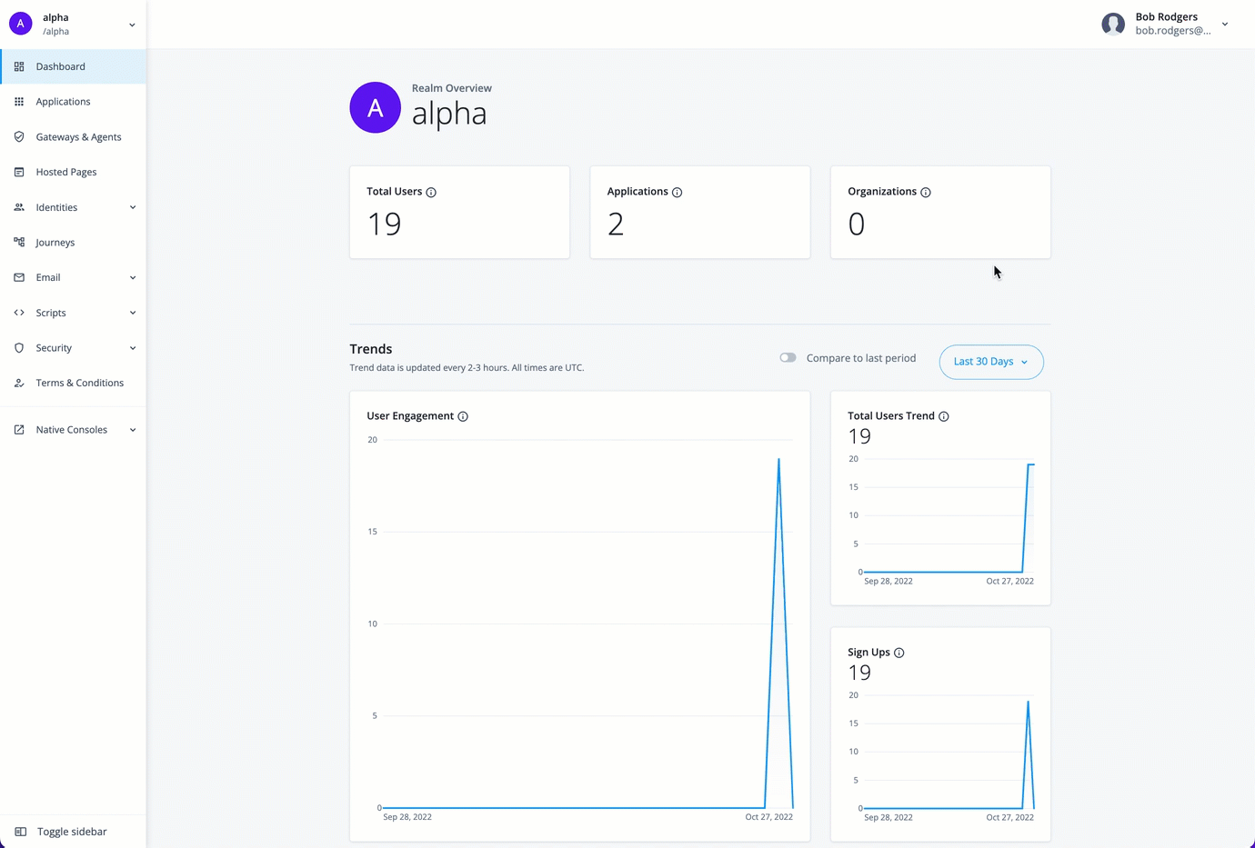
At the top of the Identity Cloud analytics dashboard, there is a summary of total number of users, applications, and organizations in your realm. These realm usage totals are summarized as follows:
-
Total Users. Displays the total count of active and inactive users in this realm.
-
Applications. Displays the total number of current applications in this realm.
-
Organizations. Displays the total number of organizations in this realm.
Below the realm usage totals, Identity Cloud analytics dashboard displays three trendline charts: user engagements, total users, and new users. These trendline charts are updated every two to three hours and are summarized as follows:
-
User Engagement. Displays the trendline of the number of user engagements within a given time period; by default, the last 30 days. A user engagement is counted when a user is involved in an identity operation within the given time period. An identity operation can be any of the following:
-
Sign-in/authentication
-
Token refresh (for example, token issuance, validation, and refresh)
-
Password creation or change
A user who has multiple user engagements within a given time period is counted once.
-
-
Total Users Trend. Displays the trendline for total users (active and inactive) during the time period in this realm.
The total users trend number may differ from the Total Usersnumber at the top of the page as the data depends on the selected time period and the update frequency. For example, new users who have been added to the system within the last hour may not appear yet on the page. -
Sign Ups. Displays the trendline for new user sign-ups during the time period in this realm.
Filter timelines
Each chart displays the usage numbers for the current time period, expressed as solid lines; the dotted lines display
the numbers for the previous time period. For example, if the time period is Last 30 days, the solid line displays
the numbers over the last 30 days from today’s date; the dotted line displays the previous 30-day numbers.
To compare the numbers for a specific date, hover over a point on either line to display the numbers for the current and the previous time periods.
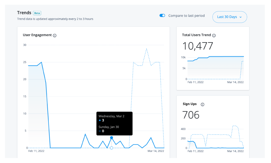
By default, the Identity Cloud analytics dashboard displays the number of engagements, total users, and new user sign-ups for a 30-day period, you can filter the output by changing the time period.
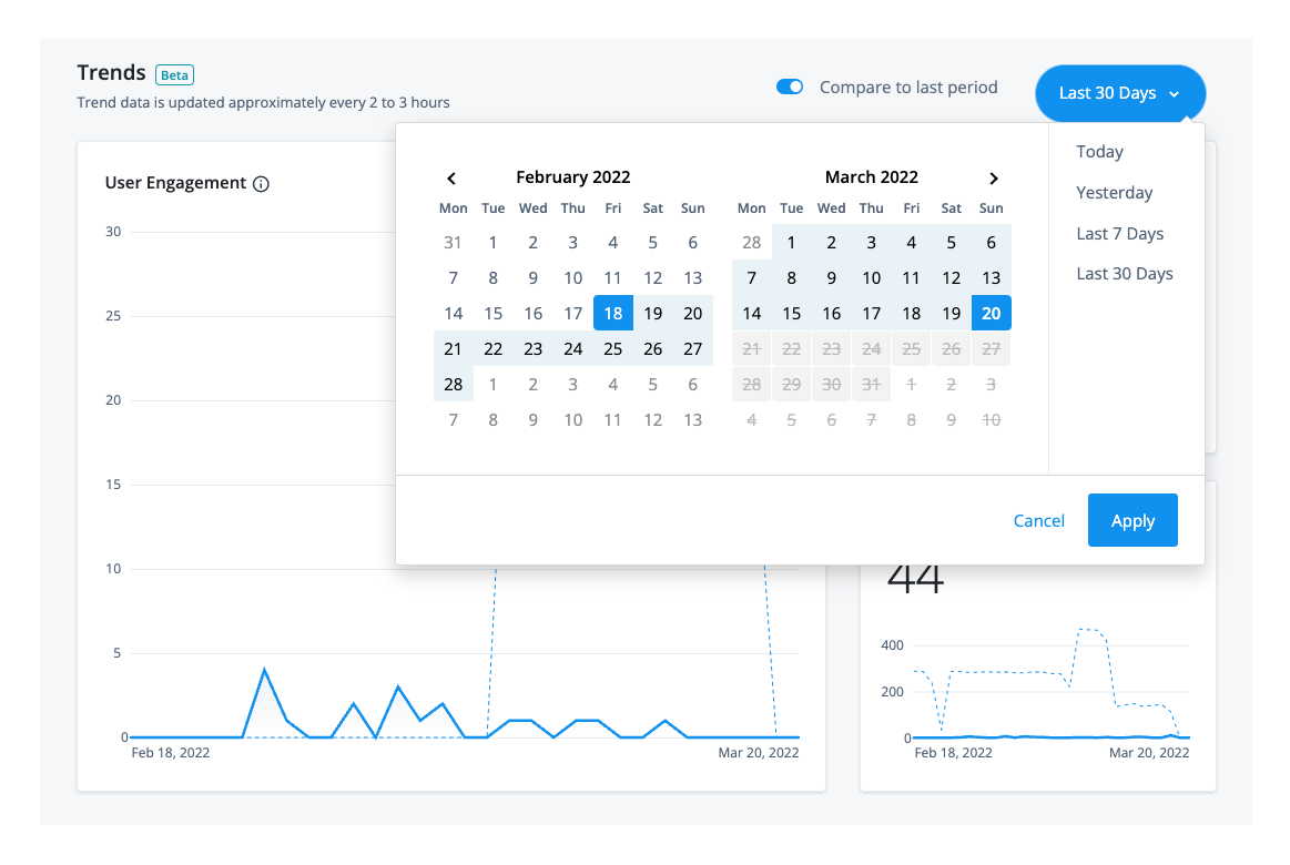
Change the time period for the trendline charts
-
Click Last 30 days, and select one of the following time periods:
-
Today. Displays the numbers for
today,12:00 a.m. to the current time. -
Yesterday. Displays the numbers for
yesterday,12:00 a.m. to 12:00 p.m. on the previous day. -
Last 7 Days. Displays the numbers for the last seven days from today’s date.
-
Last 30 Days. Displays the last 30 days from today’s date. This is the default time period.
All dates and time periods are based on UTC time.
-
-
Click Apply to save your changes.
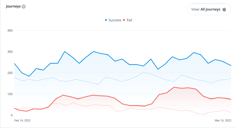
Monitor journeys
You can refer to a chart on the number of successful and failed journey outcomes within your realm on the Identity Cloud analytics dashboard. Scroll down the Identity Cloud analytics dashboard page to refer to the Journeys graph.
By default, the Identity Cloud analytics dashboard displays the aggregation of all successful and failed journeys on the Advanced Identity Cloud. These aggregations express four different types of information:
-
Blue lines indicate successful journey outcomes.
-
Red lines indicate failed journey outcomes.
-
Solid lines indicate the journey outcomes that occurred within the current selected time period.
-
Dotted lines indicate the journey outcomes in the previous time period.
| The journey usage is not counted if the journey is used as a node in another journey. |
The Identity Cloud analytics dashboard also lets you filter the chart by journey type. The available journeys are listed on the Advanced Identity Cloud Journeys page and includes any custom journeys that you may have configured. For example:
-
EvaluateRisk
-
ForgottenUsername
-
Login (default)
-
PasswordGrant
-
ProgressiveProfile
-
Registration
-
ResetPassword
-
Sample Tree
-
UpdatePassword
The categories are:
-
Authentication
-
Password Reset
-
Progressive Profile
-
Registration
-
Username Reset
| The journeys and categories options come from any tag that you have selected. |
Access journey pass/fail details
The Journeys chart also lets you drill down at specific points on a trendline to access its details, or metric breakdown. Red lines indicate failed journeys. Blue lines indicate successful journeys.
For example, you can use the Metric Breakdown page to review the journeys for the selected date, sorted by a ranking of percentage failures (default). The percentage is calculated for each journey as the total outcomes passed or failed, and then sorted in descending order from the highest failed journey by percentage to the lowest failed journey by percentage.
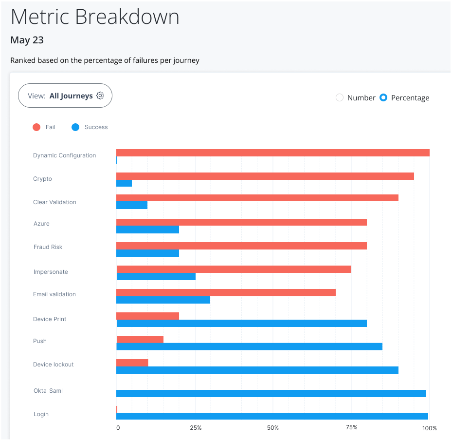
The Metric Breakdown page also lets you sort the journeys by number ranking. Number indicates the actual number of successful or failed outcomes for each journey.
The following table provides an example of how the analytics dashboard ranks by percentage and by number:
| Journey | Total Outcomes | Passed | Failed | Percentage Rank | Number Rank |
|---|---|---|---|---|---|
A |
900 |
630 |
270 (30%) |
2 |
1 |
B |
100 |
50 |
50 (50%) |
1 |
2 |
C |
100 |
80 |
20 (20%) |
3 |
3 |
| Timeouts are not displayed in the Journey outcomes. |
Access the metric breakdown page
-
On the Journeys chart, hover anywhere over a trendline to view the successful or failed outcomes for that date, and then click View detail. The Metric Breakdown page appears with more insights on the individual journeys. By default, All Journeys and Percentage are selected.
-
On the Metric Breakdown page, click Number to display the number of failed and successful journeys sorted by rank.
Click to show how to access the metric breakdown page
Top Five Journeys by Outcome and Top Five Journeys by Usage widgets
The Identity Cloud analytics dashboard displays two additional widgets providing trendlines into your journeys: Top Five Journeys by Outcome and Top Five Journeys by Usage. The Top Five Journeys by Outcome widget displays the top five journeys ranked by percentage failed or successful. The default selection is Fail. You can change the selection to Success to display top five successful journeys.
The Top Five Journeys by Usage widget displays the top five most or least used journeys. By default, the most used journeys are selected. Each bar chart provides the percentage usage of the journey in the given time period based on the outcomes only. For each journey, the calculation is based on the total number of outcomes for the journey divided by the total number of all journey outcomes in the time period.
| The widgets only display the journey outcomes for the selected time period. The x-axis denotes the percentage outcomes in the journey. |
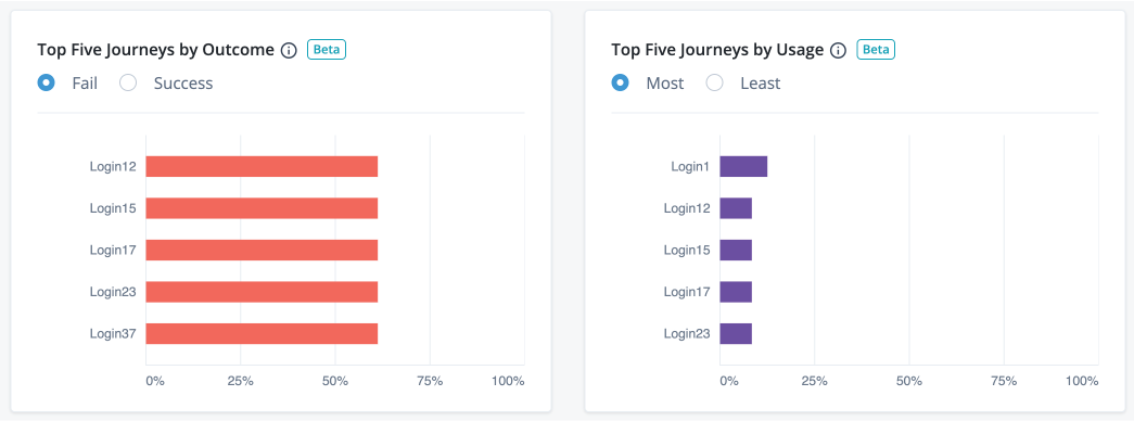
Access top five journeys by outcome and top five journeys by usage
-
On the Top Five Journeys by Outcome widget, the widget displays the top five failed journeys by default. Click Success to display the top five successful journeys.
-
On the Top Five Journeys by Usage widget, the widget displays the most used journeys by default. Click Least to display the least used journeys.
Notice
The analytics dashboard service provides key insights and trends with respect to successful or failed journey outcomes, number of users, user engagement, number of new users (sign-ons), applications, and organizations. By leveraging this functionality, Ping Identity customers can better understand their usage of the Advanced Identity Cloud. This functionality also allows Ping Identity to maintain accurate billing information with respect to such use.
All data Ping Identity collects for the purposes of providing the analytics dashboard service is anonymized using industry standard practices. The purpose is to ensure that the data does not contain any personally identifiable information, and further, so it cannot be re-identified. This includes, but is not limited to, a one-way SHA-256 hashing function that returns a hexadecimal representation of a UUID. This ensures that no personally identifiable information is used by Ping Identity, or any other third-party or system.