Customize login and end-user pages
If you choose to present pages to end users by selecting the hosted pages UI integration option, customize the PingOne Advanced Identity Cloud provided pages with themes.
Themes let you customize the look and feel of login and Advanced Identity Cloud end-user UI pages, including the information presented to end users and the actions they can take when logged into the Advanced Identity Cloud end-user UI.
Notes on themes:
-
Advanced Identity Cloud realms have a default theme that includes the colors of buttons and links, typefaces, and so on. This default theme applies to the end-user and login UIs. You can add custom themes so that your end users are presented with screens specific to their authentication journey.
-
Custom themes let you create a different look and feel for each brand that you support, including logos, favicon, headers, footers, scripted tags, and the actions and information end users can see in the Advanced Identity Cloud end-user UI.
-
A theme is followed throughout an authentication journey. This means that if a user logs in through the Login UI with a specific theme, the remaining pages in the journey will have that same theme.
Add a custom theme
In the Advanced Identity Cloud admin UI:
-
Select Hosted Pages > + New Theme.
Duplicate an existing theme by clicking next to the theme you want, then select Duplicate. -
Enter a theme name that describes the theme’s purpose; for example, the brand associated with an authentication journey.
-
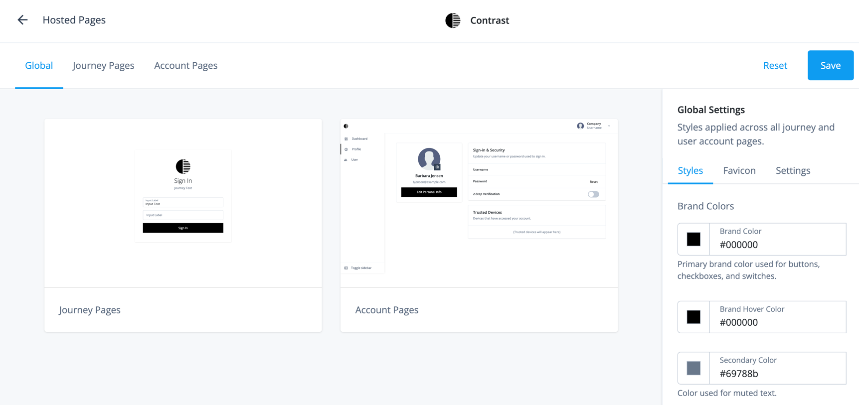
Use the tabs and options to customize various aspects of the theme:
Tab Option What you can customize Global
Styles
You can customize:
-
Brand Colors — This includes colors for buttons, checkboxes, switches, high-level alert actions, and success actions.
-
Typography — The font applied to all journeys and customer-facing pages.
-
Buttons — The colors of buttons and their radius.
-
Links — The color of links, including when you hover over them and the option to bold all links.
-
Switches — The background color.
Favicon
Favicon logo displayed for all journey and account pages. You can localize the favicon. Learn more in Localize the favicon and theme logo.
Settings
The theme name and any journey(s) using this theme.
From this screen, you can select journeys to apply to your theme. Journey Pages
Styles
You can customize:
-
Page Background — This includes the color of the journey background as well as a background image (optional).
-
Sign-in Card — The sign-in card is where end users enter their credentials. This includes the card colors, field colors, card shadow, border radius, and if the input text labels should sit above or in the input field.
-
Global Styles — These are the styles you set in the Global tab. Modifying this section from the Journey Pages updates the Global tab styles.
Logo
Logo to display on sign-in and registration pages. The displaying of the logo is optional. You can localize the logo. Learn more in Localize the favicon and theme logo.
Layout
This includes:
-
Layout — The position of the sign-in card on the page.
-
Button Position — The position of the button inside the sign-in card.
-
Header and footer: Place a header above or a footer below the sign-in card.
-
Error Heading Fallback — Turn off the error heading that displays as a fallback if there is no heading in the page content.
-
Remember Me — Add a checkbox to the sign-in card that lets end users choose to have their username remembered and prepopulated. If checked, the UI stores an end-user’s username in local storage after their next sign-in attempt.
The optional Label field lets you specify a custom label to display to the end user to replace the default label of Remember Me.
-
Scripted Tags — Add HTML scripted tags to journey pages.
-
Focus First Form Item — Focus the first form input or button on each journey step.
Account Pages
Styles
This includes customizing the colors of:
-
The left end-user Navigation pane.
-
The Top Bar where the user logs out.
-
The Page Styles that present user information.
-
The Cards that are contained within the page that display various information.
-
Global Settings — These are the styles you set in the Global tab. Modifying this section from the Account Pages updates the Global tab styles.
Logo
Logo to display on customer-facing pages
Layout
This includes:
-
Profile Page — Learn more in Configure visible information and end-user actions.
-
Footer: Place a footer below all acount pages.
-
Scripted Tags — Add HTML scripted tags to account pages.
-
-
Configure the new theme as the default theme for the realm:
The default theme is the theme that’s used when you don’t apply a specific theme to an authentication journey.
-
From the Advanced Identity Cloud admin UI, go to Hosted Pages.
-
From the list of themes, click the ellipsis (…).
-
Click Set as Realm Default.
-
Localize the favicon and theme logo
To localize the favicon or theme logo:
-
On the Global, Journey Pages, or Account Pages tabs, click the Favicon or Logo tabs from the right pane.
-
Click the favicon or logo .
-
Click + Specify a Locale.
-
In the Locale field, enter the ISO 639-1 (2 letter country code) for the language. For example, for French the value would be
fr. -
Click Add.
-
In the Favicon URL field or the Logo URL field, enter the URL for the favicon or logo.
The images must be publicly accessible. -
To set alternative text for the logo, in the Alt Text field, enter alternate text.
-
Click Update.
-
Click Save.
Apply a custom theme to a journey
In the Advanced Identity Cloud admin UI:
-
Select Journeys.
-
Select the journey to apply the custom theme.
-
Click Edit.
-
Click ... > Edit Details.
-
Select Override theme.
-
Select the custom theme that you want to apply to this journey, then click Save.
|
Theme definitions and the mappings between authentication journeys and themes are stored in
Advanced Identity Cloud as configuration objects. They are therefore "static" in terms of Advanced Identity Cloud promotion.
If you add a new theme or logo, your change must go through the promotion process. Theme
selection can be dynamic, however. If you set a theme in a page node during a journey, for
example, by setting |
Custom headers and footers
Each theme lets you configure localized custom headers and footers:
| Header | Footer | |
|---|---|---|
Journey pages |
||
Account pages |
n/a |
Headers and footers can take HTML or inline CSS to insert links, classes, and other elements. Scripting isn’t supported in headers and footers.
The account footer is separate from the journey footer. This lets you set up different buttons, links, and other elements, that display to an end user after they log in.
Enable headers and footers for a theme
-
In the Advanced Identity Cloud admin UI, go to Hosted Pages, then select a theme.
-
Select either Journey Pages or Account Pages.
-
In the panel on the right-hand side, click Layout.
-
Find the Header section (journey pages only), then enable the switch.
-
Find the Footer section, then enable the switch.
-
Edit headers and footers
-
Follow the steps above to find the appropriate Header or Footer section, then click the preview to open the editor.
-
If you do not need localized content, edit the HTML as appropriate, then go to step 4.
-
If you need localized content:
-
Add as many locales as you need. Learn more in Localize headers and footers.
-
Use the locale selector to change locales, and edit the HTML in each locale as appropriate.
-
-
Click Save.
Localize headers and footers
-
Follow the steps above to find the appropriate Header or Footer section, then click the preview to open the editor.
-
To add an initial locale for the existing header or footer content:
-
Click + Specify a Locale to open a secondary modal.
-
In the Add a Locale secondary modal, enter a locale identifier; for example,
fr(French), orfr-ca(French - Canada). -
Click Add to add the locale and close the secondary modal.
-
The + Specify a Locale link will now be replaced by a locale selector, with the new locale preselected.
-
-
To add an additional locale:
-
Click the locale selector, then click + Add Locale to open a secondary modal.
-
In the Add a Locale secondary modal, enter a locale identifier; for example,
es(Spanish), ores-ar(Spanish - Argentina). -
Click Add to add the locale and close the secondary modal.
-
The new locale will now be available in the locale selector, and be preselected. The header or footer content for the new locale will be a copy of the header or footer content from the initial locale.
-
Translate the header or footer content for the new locale.
-
-
Repeat step 3 for as many locales as you need.
-
Click Save.
Configure actions and information for end users
Login UI
You can configure the following self-service features to control the actions and information displayed to end users in the Advanced Identity Cloud login UI:
Configure terms and conditions
Configure the terms and conditions your end users must accept before they can complete a registration journey. Learn more in Terms and conditions.
Configure privacy and consent
Configure the external resources your end users can choose to share their data with. Learn more in Privacy and consent.
Configure security questions
Configure the security questions your end users answer during a registration journey and can later use during a reset journey to verify their identity. Learn more in Security questions.
End User UI
You control the information that is displayed and the actions end users can take from the Advanced Identity Cloud end-user UI.
The information and actions are broken out into the following sections:
Configure visible information and end-user actions
Your end users can only see the information and take actions that you configure.
To configure the information users can see and the actions they can take:
-
From the Advanced Identity Cloud admin UI, go to Hosted Pages.
-
Select a theme or click + New Theme.
If you create a new theme, enter a Name for the theme and click Save.
-
Select Account Pages from the top tabs. This refers to the Advanced Identity Cloud admin UI pages.
-
In the tabs displayed in the right pane, select Layout.
-
The Profile Information section dictates the actions and information end users can see. Select or deselect any of the following:
Profile page component Description Personal Information
Enable to allow the end user to view their attributes and update them. The attributes that display depend on settings at the property level. Learn more in Configure properties end users can view and update.
Sign-in & Security
Enable any of the following:
-
Password — Allow end users to update their password. Uses an existing session. This correlates to the default journey UpdatePassword.
To change the journey used for password updates:
-
From the Advanced Identity Cloud admin UI, select Native Consoles > Access Management.
-
From the left navigation pane, click Services.
-
Select Self Service Trees.
-
In the updatePassword field, enter the name of the journey.
-
Click Save Changes.
-
-
Security Questions — Allows end users to reset their security questions on their profile.
-
2-step verification — If an end user has registered a device for two-factor/MFA, this option displays as enabled.
If enabled, an additional Change button displays to end users. End users can select this button to rename their device(s) or delete their device(s) from Advanced Identity Cloud.
Social Sign-In
Allows end users to view the social providers that have authenticated with, such as Google or FaceBook.
For details on letting end users connect to social providers from their profile page, learn more in Social authentication. After you configure social providers and create the journey, add it as the connectSocial journey for the realm:
-
From the Advanced Identity Cloud admin UI, select Native Consoles > Access Management.
-
From the left navigation pane, click Services.
-
Select Self Service Trees.
-
Add a connectSocial field whose value is the name of the journey.
-
Click Save Changes.
Trusted Devices
Lets end users view the devices that have been used to log in to their account. End users can update the name of the device.
To populate the Trusted Devices tab, add the Device Profile Collector node to your authentication journeys to collect end-user device information. Authorized Applications
Allows end users to view and manage the applications that have access to their personal information.
Preferences
Allows end users to view and set preferences for communication. For example, an end user can select if they would like to receive emails regarding special offers and services.
Consent
Allows end users to view and manage how their data is shared with third parties.
Account Controls
Allows end users to download the data Advanced Identity Cloud has about them in a JSON format and allows end users to delete their account (identity) information.
-
-
Click Save.
Configure properties end users can view and update
When an end user logs into the Advanced Identity Cloud end-user UI and selects Profile > Edit Personal Info, their profile data in Advanced Identity Cloud displays.
When you enable end user’s personal information from the theme, all the Advanced Identity Cloud properties are marked as User Editable. This means that end users can view and update most of their data in Advanced Identity Cloud. However, you may or may not want users to see all of their data.
For example, if you are not using all the properties available to you in Advanced Identity Cloud to store data for your end users, you might want to hide the unused properties for your end users, to decrease confusion and clutter.
To disable user properties from displaying to an end user, follow these steps:
-
From the Advanced Identity Cloud admin UI, select Native Consoles > Identity Management.
-
Select Configure > Managed Objects from the top tabs.
-
The user object to update, such as Alpha_user or Bravo_user.
-
From the Properties tab, select the property to modify.
-
From the properties screen, under the Details tab, select Show advanced options.
-
Disable the User Editable radio button.
-
Click Save. The property is now hidden from the end user.
-
Repeat steps 5-7 for every property you want to hide from the end user.
The following example shows:
-
The Description property being visible to the Advanced Identity Cloud end-user UI.
-
Going to Native Consoles > Identity Management and disabling the User Editable field for the Description property.
-
Going back to the Advanced Identity Cloud end-user UI, refreshing the page, and showing that the Description property no longer displays to the end user.
Use script tags in Advanced Identity Cloud end-user and login UIs
You can include script tags in Advanced Identity Cloud end-user and login UIs to integrate third-party scripts such as customer analytics.
-
In the Advanced Identity Cloud admin UI, go to Hosted Pages, then select a theme.
-
Select either Journey Pages or Account Pages.
-
In the panel on the right-hand side, click Layout.
-
Find the Script Tags section.
-
In the HTML field, enter your script code. The following example adds a script for the OneTrust cookie consent service:
<script type="text/javascript" charset="UTF-8" src="https://cdn.cookielaw.org/scripttemplates/otSDKStub.js" data-domain-script="<account-id>"></script>(1)
<script type="text/javascript">
  function OptanonWrapper() {};
</script>
1 In this example, <account-id>needs replacing with a OneTrust account ID.-
Do not attempt to use scripts with nested nodes. All nodes must be at the same level.
-
The script code can include comments.
-
The script code can include all valid attributes listed here: https://developer.mozilla.org/en-US/docs/Web/HTML/Element/script#attributes..
-
The script code must be wrapped in
<script>tags.
-
-
Click Save.
-
-
Update the tenant’s Content Security Policy:
-
If the tenant has an active report-only policy, update it by adding the domain of the third-party script to the
script-srcpolicy directive. -
If the tenant has an active enforced policy, update it by adding the domain of the third-party script to the
script-srcpolicy directive.
-