Tune the model
|
End of life for Autonomous Access After much consideration and extensive evaluation of our product portfolio, Ping Identity is discontinuing support for the Advanced Identity Cloud Autonomous Access product, effective October 31, 2024. To support our Autonomous Access customers, we’re offering migration assistance to PingOne Protect, an advanced threat detection solution that leverages machine learning to analyze authentication signals and detect abnormal online behavior. PingOne Protect is a well-established product, trusted by hundreds of customers worldwide. The end of life for Autonomous Access indicates the following:
For any questions, please contact Ping Identity Support for assistance. |
Training model terms
The following training model terms are presented to better understand the tuning models:
-
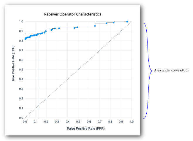
Receiver Operator Characteristics. A receiver operator characteristic (ROC) curve is graphical plot that shows the tradeoffs between true positives and false positives of a model as the risk threshold changes. The x-axis shows the false positive rate (FPR), the probability of a false alarm; the y-axis shows the true positive rate (TPR), probability of correct detection. The diagonal line is a random classifier, which serves as a baseline to evaluate the performance of a classifier. The points above the diagonal represent good classification results; points below the diagonal represent bad results. The ROC curve with blue points is a probability curve, which represents the varying trade-offs between the true positive rate and false positive rate at different probability thresholds. The ideal representation is called a perfect classification, where (0,1) indicate no false negatives and 100% true positives, and where the graph looks like an upside-down "L". The Area under the curve (AUC) represents how well the model can distinguish a true positive and a false negative. The higher the AUC value (closer to 1), the better the model is at distinguishing between a risky threat and no threat.
-
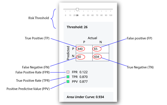
Confusion Matrix. A confusion matrix is an 2x2 (also called a binary classification) table that aggregates the ML model’s correct and incorrect predictions. The horizontal axis is the actual results; the vertical axis is the predicted results. Note that each prediction in a confusion matrix represents one point on the ROC curve.
-
True Positive. A true positive is an outcome where the model correctly identifies an actual risky threat as a risky threat.
-
True Negative. A true negative is an outcome where the model correctly identifies a non-risky threat as a non-risky threat.
-
False positive. A false positive is an outcome where the model incorrectly identifies a non-risky threat as a risky threat.
Customers care a lot about false positives, because it affects the user’s runtime experience. Also, note that false positives is the rate that we are correctly flagging anomalies, not real fraud. -
False negative. A false negative is an outcome where the model incorrectly identifies a risky threat as a non-risky threat.
-
True Positive Rate (TPR). The rate of probability of detection, where TP/(TP+FN), where TP is the number of true positives and FN is the number of false negatives. The rate is the probability that a positive threat is predicted when the actual result is positive. The TPR is also known as recall.
-
False Positive Rate (FPR). The rate of the probability of a false alarm, where FP/(FP+TN), where FP is the number of false positives and TN is the number of true negatives. "FP+TN" is the total number of negatives. The rate is the probability that a false alarm will be raised, where a positive threat is predicted when the actual result is negative.
-
Positive Predictive Value (PPV). The rate where TP/(TP+FP), where TP is the number of true positives and FP is the number of false positives. "TP+FP" is the total number of positives. The ideal value of the PPV with a perfect prediction is 1 (100%), and the worst is zero. The rate is the probability that a predicted positive is a true positive. The PPV is also known as precision.
-
Area under the curve. On a scale from 0 to 1, the area under the curve (AUC) shows how well the model distinguishes between a true positive and false negative. If the AUC is closer to 1, the better the model.
-
Centroids. On model C, the centroids represents a typical user and describes the profiles of known users.
-
Precision Recall. The precision recall curve is a graphical plot that shows the tradeoff between precision and recall for different threshold values. The Y-axis plots the positive predictive value (PPV), or precision; the x-axis plots the true positive rate (TPR), or recall. A model with ideal results are at the point (1,1). The precision recall is a different way to view the model’s performance. Most users can use the ROC and confusion matrix.
| The Ensemble model is the best average of the three models and should show better results than each individual model. The model C chart is a choppier step graph. |
Tuning Training
Autonomous Access supports the ability to tune the AI/ML training models for greater accuracy. There are three things that you can check to look at ML model performance:
-
Training logs. Each model generates a metadata file that show the
train_lossesandval_losses(validation losses).Train lossindicates how well the model fits the training data.Validation lossindicates how well the model fits new training data. The losses tend to move down from a high value (near 1) to a low value (toward 0).Another thing to look at is how good are the train losses to the validation losses. The bigger the gap between the two loss numbers is an indicator that the model memorizes the training set but does not generalize very well. One thing you can do to improve this value is increase the number of epochs and make the learning rate smaller, which adjusts the model closer to data. For the embedding model, you can increase the window size and decrease the learning rate to improve results.
If you are seeing a model with a big gap between the training loss and validation loss, it could mean you have too many parameters, meaning that an overfitting of data is taking place. One possible solution is to reduce the embedding dimension. Again, ask the ForgeRock for assistance. -
ROC curve and confusion matrix. You can view the receiver operator characteristics (ROC) curve and confusion matrix on the UI.
-
Risk Configuration. The Autonomous Access lets you fine-tune the backend AAI server. For more details, refer to Configure the risk settings.
Tune the training models
-
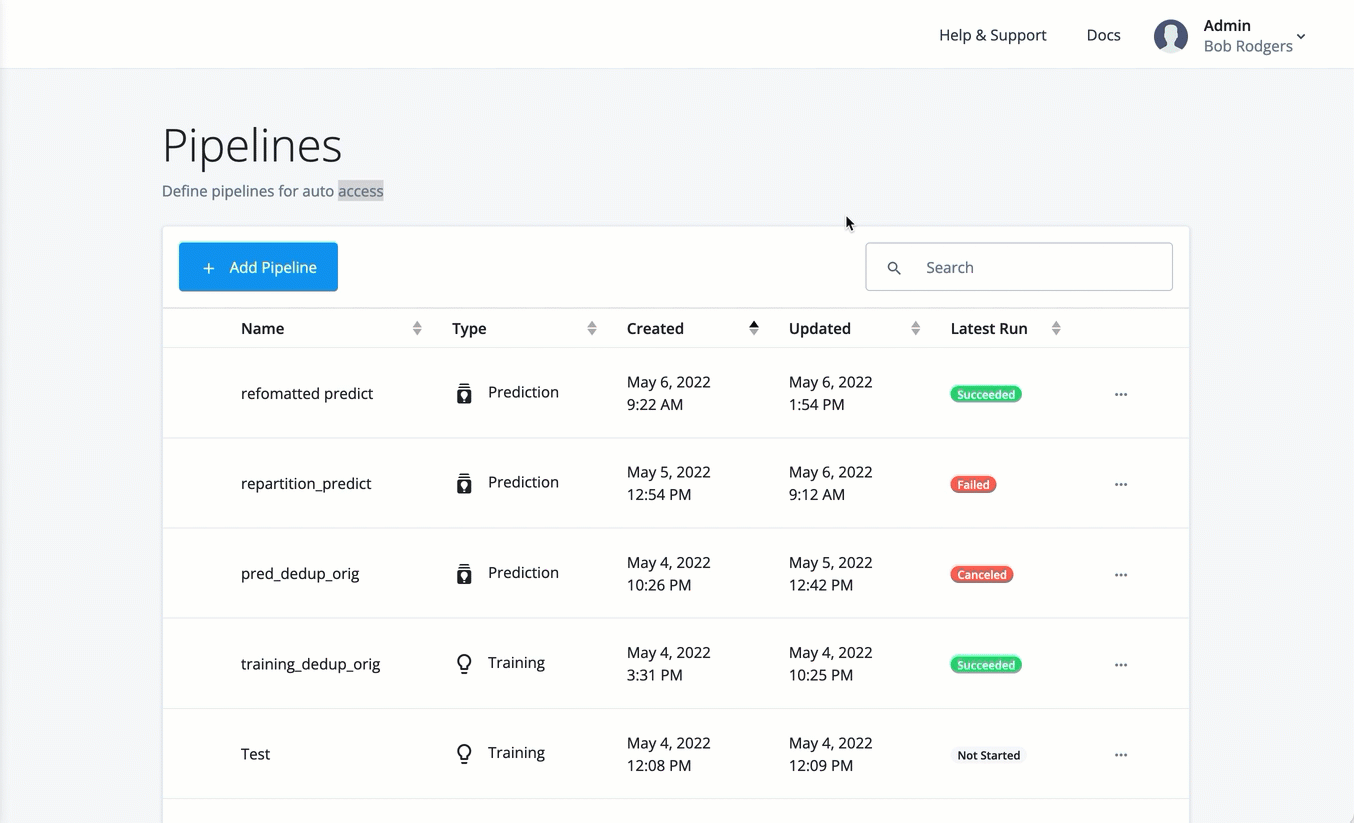
On the Pipelines page, click the dots next to a training run, and then click View Logs.
-
Click the dots next to a training run, and then click View Run Details.
-
On the Training Execution Details, click the dots, and then click Results. The training results are displayed.
-
Tune each model by adjusting the threshold. You can select the model on the drop-down list, and adjust the threshold to view the optimal balance of parameters in the confusion matrix on the Decision node. You can view the graphs of the following models:
-
Ensemble. Displays the best average of all charts in one view.
-
Model A. Displays the Model A charts.
-
Model B. Displays the Model B charts.
-
Model C Displays the Model C charts.
ForgeRock’s data science experts can assist you in this process.
-
-
To close the dialog, click OK.
-
Finally, if you are satisfied with the models' performance, click Publish to save the training model. Once published, you can only overwrite it with another training run.
As a general rule of thumb, ForgeRock recommends to publish the models with an AOC > 0.9. For more information, contact your ForgeRock representative. Display an example